Why Certain Colours Make You Hungry (And Restaurants Know This)
You can walk past a restaurant feeling perfectly fine, spot its glowing red sign, and suddenly start thinking about fries.

You can walk past a restaurant feeling perfectly fine, spot its glowing red sign, and suddenly start thinking about fries. Your eyes and your appetite have a much closer relationship than you might expect, and food brands have spent decades making the most of it.
The Colours That Get Your Attention
1. Red can make food feel more urgent
Red grabs your attention quickly, which helps explain why restaurants love putting it on signs, menus and packaging. Your brain associates the colour with things that demand notice, from ripe fruit to warning signals. That doesn't magically make your stomach empty, but it can make food harder to ignore. There's another practical advantage: red remains highly visible from a distance, which matters when you're driving past a restaurant at 40 mph.
2. Yellow makes a restaurant hard to miss
Yellow has one enormous advantage in the battle for your lunch money: visibility. Bright yellow stands out quickly, particularly when brands pair it with darker colours or red. That's useful for roadside restaurants that have seconds to catch your eye. Yellow also carries cheerful, energetic associations in many Western settings. Put those qualities together and you get a colour that says "look over here" before you've consciously decided where you're eating.
3. Red and yellow became fast-food royalty
Once you notice the combination, you can't unsee it. McDonald's, Burger King, Wendy's and plenty of smaller chains have all leaned on red and yellow at some point. The pairing works because both colours command attention while creating a warm, energetic look. But there's a less psychological reason too. Strong primary colours reproduce clearly on signs, wrappers and advertising, which made them especially useful long before brands had glowing smartphone screens to worry about.
Your Brain Eats With Your Eyes
4. Colour can change what you think you're tasting
Your tongue doesn't work alone. Your brain combines taste, smell, texture and appearance into the experience you call flavour, so changing a food's colour can change what you expect before you swallow it. Give someone a drink with an unexpected colour and identifying its flavour can become harder. That's why a bright orange drink can seem more "orange-flavoured" before you've properly tasted it. Your eyes have already submitted their review.
5. Blue has a strange relationship with appetite
Blue rarely dominates restaurant branding, and food itself gives you a clue why. Naturally blue foods exist, including blueberries and some varieties of corn and potatoes, but they're relatively uncommon compared with green, red, yellow and brown foods. That makes blue a less automatic visual signal for "eat this." Still, the internet claim that blue simply kills your appetite goes too far. Context, culture and the actual food matter far more than one paint colour.
6. Green can make food look healthier
Green carries a powerful food shortcut because you see it constantly in vegetables, herbs and fresh produce. Restaurants and packaged-food brands can use that association to make a dish or product feel fresher before you inspect what's actually in it. Here's the sneaky part: the colour doesn't have to appear in the food. Green logos, menu sections, packaging and décor can all help create the same impression. Your salad hasn't changed. Its surroundings have.
The Room Is Part of the Meal
7. Warm colours can make a space feel busier
Red, orange and yellow don't only appear in logos. Restaurants often bring warm colours into walls, furniture, lighting and graphics to create an energetic atmosphere. In a fast-food setting, that liveliness fits the whole experience: choose, eat, move on. But colour doesn't operate like a secret eject button. Music, seating, lighting and crowding also affect how long you want to stay. The clever part comes from making all those signals point in the same direction.
8. Fancy restaurants often turn the colour volume down
Compare a burger chain with an expensive dining room and you'll often see a completely different palette. High-end restaurants frequently favour muted greens, deep blues, creams, browns or darker neutral shades rather than covering every surface in bright primary colours. That calmer visual environment suits a slower meal where lingering isn't a problem. And there's a commercial reason for that. If you're comfortable ordering another drink or dessert, your table becomes more valuable without feeling rushed.
Your Plate Has Tricks Too
9. Plate colour can change how much food seems to be there
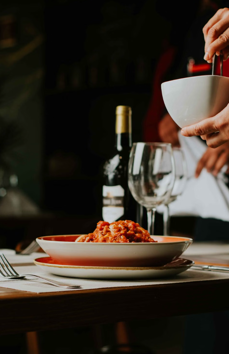
The plate underneath your dinner isn't visually neutral. Contrast between food and crockery can affect how clearly you perceive a portion, which may influence serving and eating behaviour in some situations. Picture pale pasta on a white plate versus the same pasta on a dark blue one. The second version has a much sharper outline. Restaurants care about that contrast for another reason as well: a carefully chosen plate can make an ordinary ingredient look far more dramatic.
10. There isn't one universal "hunger colour"
This is where the neat colour-psychology charts fall apart. Red doesn't contain a biological command that tells every human to order a cheeseburger, and blue doesn't automatically shut down hunger. Your response depends on context, learned associations, culture, lighting, branding and what you're actually looking at. Restaurants know this, which is why the smartest ones build a whole visual experience rather than betting everything on one shade. Colour works best when everything around it backs up the message.
Next time a menu, logo or dining room suddenly makes dinner seem like an excellent idea, look at the colours before you blame your stomach. Share this with someone who'll never look at a red-and-yellow restaurant sign the same way again.

Ira kapoor
Author at SofaBreak — writing on facts and everyday curiosities.